Why Your App Needs a Mascot (and How to Design One)
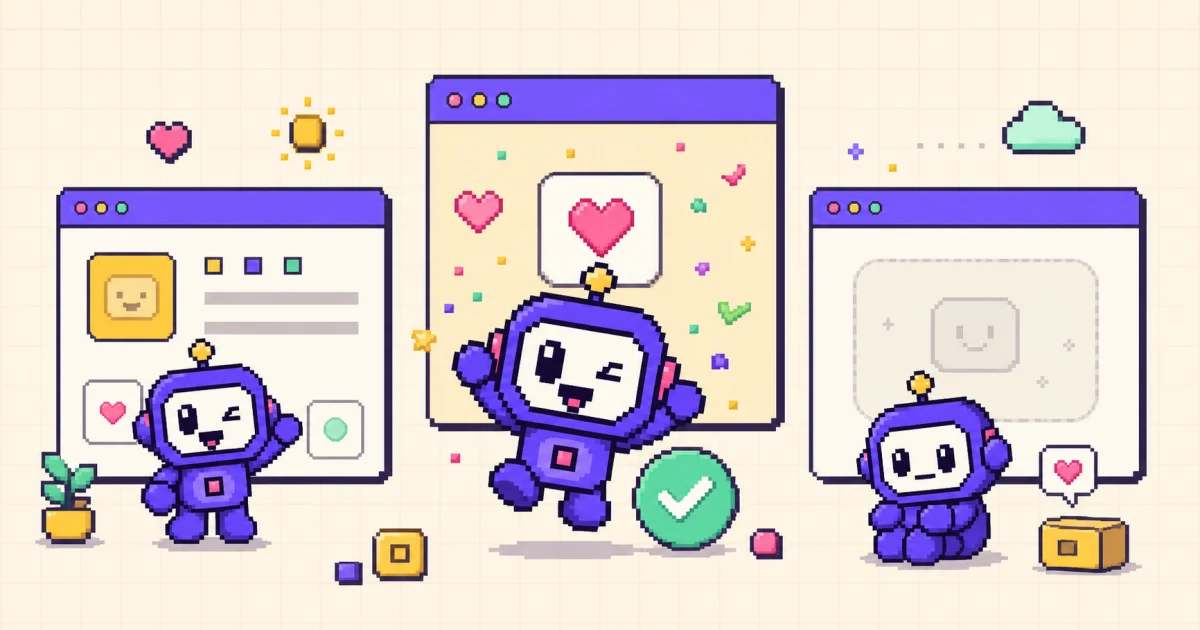
TL;DR: Apps use mascots to strengthen brand recognition, give emotional product moments a consistent voice, and make onboarding, empty states, success, and recovery screens feel warmer and more intentional. A good mascot has a simple silhouette, a limited brand-aligned palette, a small set of clear emotional states, and consistency rules that keep the character recognizable across poses and channels. Motif lets you generate an animated mascot from a character description and export platform-ready sprite bundles for iOS, Android, Unity, and Godot without hiring an animator or opening an animation editor.
An app mascot gives a product a recognizable character that can welcome users, explain an empty state, celebrate progress, or soften an error. It works best as part of the interface, not as decoration added after the product is finished.
This guide explains why apps use mascots, when one is a good fit, what makes a character effective, and how to turn a static design into a practical animation system.
Why apps use mascots
A logo identifies a company. A mascot can also act, react, and carry a tone of voice. That makes it useful at emotional moments where a generic icon or system message feels impersonal.
Teams commonly use an app mascot to:
- improve recognition with a repeatable character and silhouette;
- make onboarding and education feel more approachable;
- give empty, loading, success, and recovery states a shared visual language;
- create reusable material for social posts, release notes, and campaigns;
- make technical or intimidating subjects feel less severe.
A mascot does not automatically improve retention. Its value depends on the character, the product context, and how users respond. Treat retention or conversion as a hypothesis to test, not a guaranteed outcome.
The “Duolingo effect”
Duolingo is the clearest modern example of a mascot working across product and marketing. Duo the owl appears in lessons, reminders, campaigns, and social content with a consistent personality. The important lesson is not to copy the owl; it is to give one recognizable character a clear role across multiple touchpoints. If you want to apply this pattern directly, see how to make a Duolingo-style mascot.
Other useful patterns include:
- Mailchimp’s Freddie: makes a technical email product feel more approachable.
- Reddit’s Snoo: adapts to many communities and themes while keeping a recognizable base.
- GitHub’s Octodex: turns one core character into variations for events, teams, and culture.
- Habit and finance products: use supportive characters to reduce the severity of reminders and progress feedback.
The common thread is consistency. The mascot behaves like the same character even when its pose, outfit, or context changes.
Where a mascot helps most
Use a mascot at product moments with an emotional job:
- Onboarding: welcome the user or demonstrate the next action.
- Empty states: make “nothing here yet” feel intentional and offer a next step.
- Success states: reward meaningful progress without interrupting the task.
- Errors and recovery: acknowledge friction, then point toward a solution.
- Waiting: provide a calm idle state while useful work completes.
Avoid placing it beside every message. Repetition without purpose turns a memorable character into visual noise.
What makes a good app mascot
A simple silhouette
The character should remain recognizable at 40–80 pixels, not only in a large illustration. Test it in grayscale and at the smallest size you expect to use.
One or two distinctive features
Antennae, ears, glasses, a tail, or a signature shape make the mascot easier to recognize. Too many details make animation harder and disappear at small sizes.
A brand-aligned palette
Reuse a limited set of product colors and define contrast rules for light and dark backgrounds. The mascot should feel native to the interface.
Clear expressions
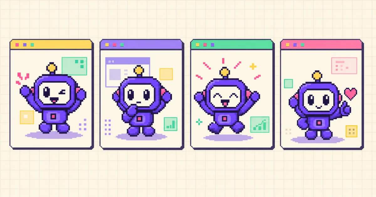
Start with a compact state system: welcome, idle, think, celebrate, and recover. Each state needs a clear purpose and should remain understandable without text.
Consistency rules
Create a short character sheet with proportions, colors, outline weight, facial placement, allowed expressions, and “never change” details. This prevents drift across designers, generators, and campaigns.
Motion with restraint
Use a wave to welcome, a bounce to celebrate, and subtle breathing for idle, not constant movement on every screen. Motion should support hierarchy rather than compete with it. Nielsen Norman Group's guidance on animation and usability makes the same point: use animation to communicate feedback and relationships, not as decoration.
When your app should not use a mascot
A mascot is not required for good branding. Skip or limit it when:
- users need speed and precision during urgent or safety-critical tasks;
- the product tone is deliberately neutral and a character would undermine trust;
- the team cannot maintain the character consistently;
- the mascot has no defined job beyond filling space;
- animation would distract from accessibility or comprehension.
In those cases, a strong icon system, illustration style, or typographic voice may serve the product better.
Static vs animated mascots
A static mascot establishes identity. Animation adds timing and reaction: a wave when the user arrives, a small celebration after a meaningful action, or a quiet idle loop while they read.
The tradeoff is production complexity. Traditional character animation can involve design, revisions, rigging or frame-by-frame work, multiple exports, and implementation. Cost and timing vary widely with style, quality, and number of motions, so plan around the required deliverables rather than a single headline estimate. If you are weighing a generator against a freelancer, see Motif vs hiring an animator.
Generator-assisted workflows can shorten the path from a reference image to a sprite loop, but they still require art direction and review. Check identity consistency, anatomy, looping, background removal, file size, accessibility, and how the motion feels inside the actual interface.
How to create an app mascot
- Define its job. Choose the first two or three product moments it will support.
- Write personality rules. Decide how it encourages, celebrates, and responds to failure.
- Design the silhouette. Keep shapes and colors readable at small sizes.
- Create a character sheet. Lock proportions, facial features, palette, and line style.
- Build a small state set. Start with idle, welcome, success, and recovery.
- Test in the interface. Review scale, contrast, timing, distraction, and reduced-motion behavior.
- Measure the result. Compare completion, engagement, dismissal, or qualitative feedback for the screens where it appears.
How to animate an app mascot quickly
With an animated mascot generator, you can describe a new character or upload an existing reference, choose a motion, and export a 12-frame loop.
Motif provides platform-oriented bundles:
- iOS
.imagesetfolders at @1x/@2x/@3x and a SwiftUI view; - Android density drawables and an
animation-list; - WebP, APNG, and CSS sprite output for the web;
- a sprite atlas and metadata for Unity and Godot.
Review the generated motion at the size and background where it will ship. For the full implementation process, see how to add an animated mascot to your app. To weigh the options first, compare the best animated mascot generators in 2026.
Frequently asked questions
Why do apps use mascots?
Apps use mascots to strengthen recognition, give messages a consistent voice, and add warmth to onboarding, empty states, success, and recovery.
Does every app need a mascot?
No. It is useful when a product benefits from encouragement or a recurring guide. It is a poor fit if it distracts from urgent work, conflicts with the brand, or has no clear role.
What makes a good app mascot?
A simple silhouette, recognizable features, a limited brand-aligned palette, clear expressions, and rules that keep the character consistent across poses and sizes.
How much does an app mascot cost?
It depends on scope. A commissioned system may include strategy, design, revisions, rigging, and several loops. Generator-assisted tools can reduce production time for concepts and sprite animations, but review and implementation still matter.
Start with a role, not a character
Pick one moment where the interface needs warmth or encouragement, define what the mascot should do there, and design around that constraint. A character with a clear job is easier to recognize, animate, and maintain than one created only to decorate the brand.
Generate an app mascot with Motif, or follow the step-by-step animated mascot implementation guide.